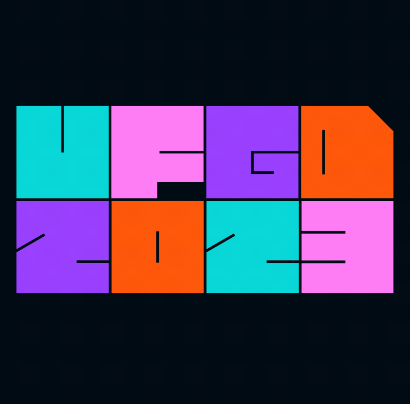
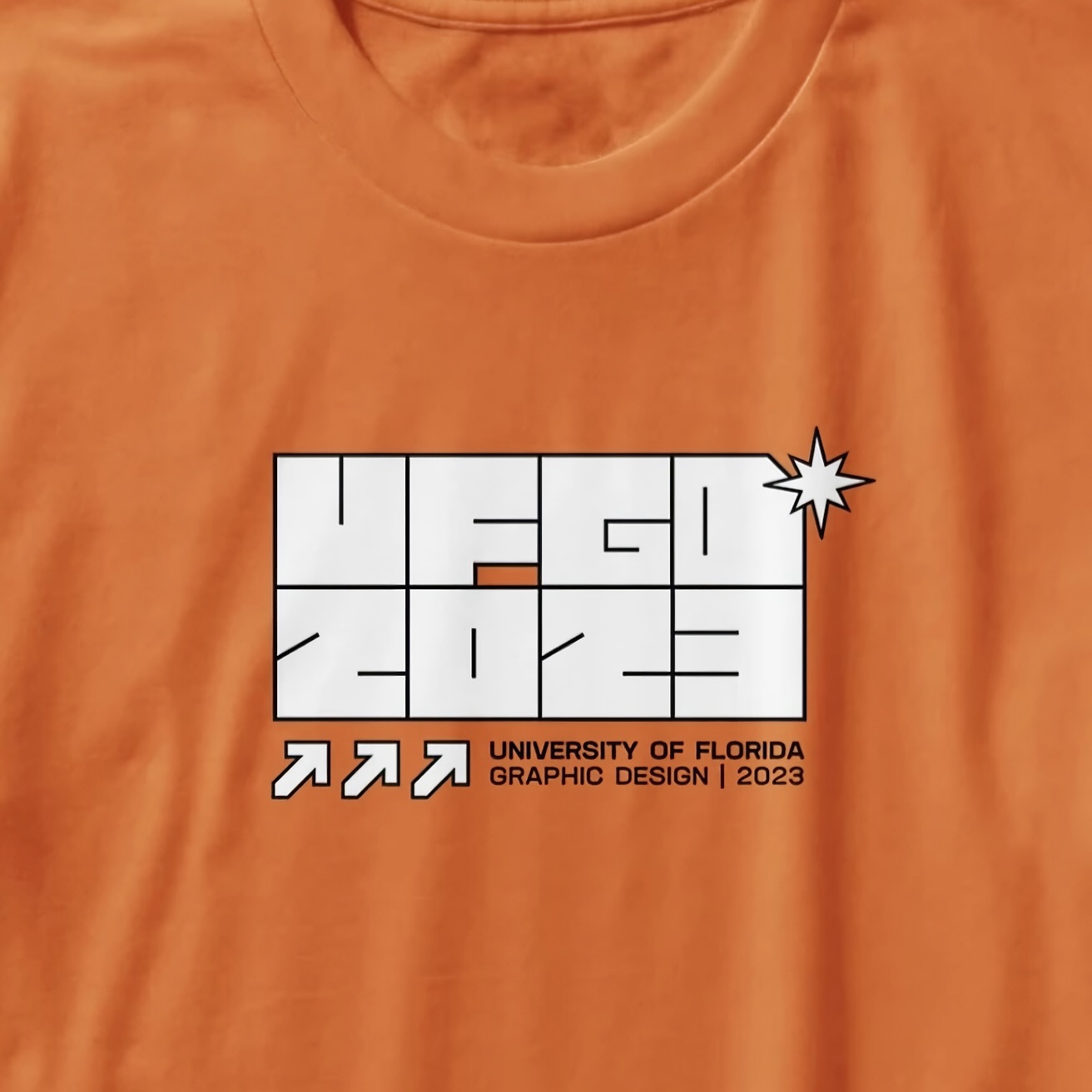
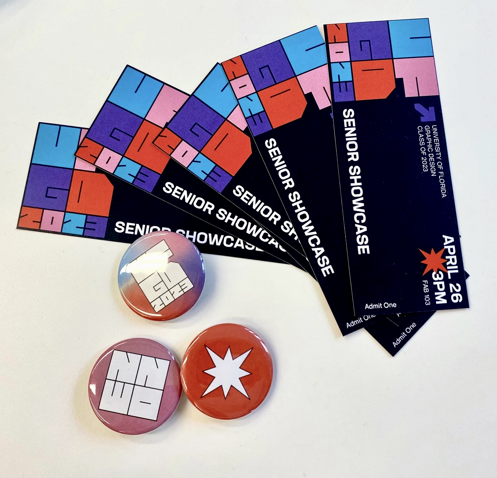
UFGD 2023
︎︎︎ branding, logo design
All of the graduating graphic design students worked together to create the materials for our senior showcase and class website. The branding team consisted of me and Sofia De Los Angeles Arias, and together we collaborated to create the visual language and oversee the other teams (content, event, marketing, merch, web design, web development) to make sure branding stayed consistent across deliverables.

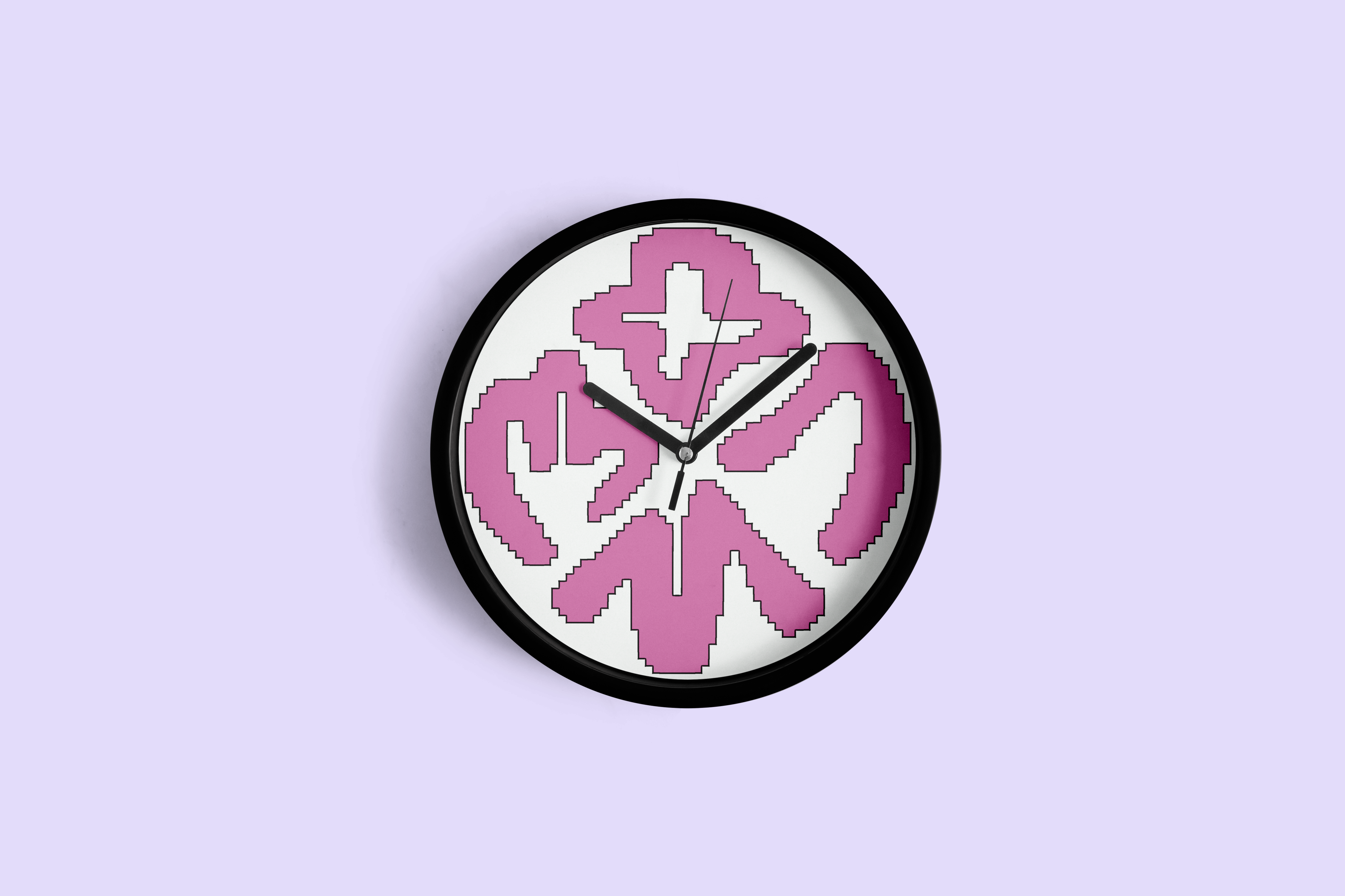
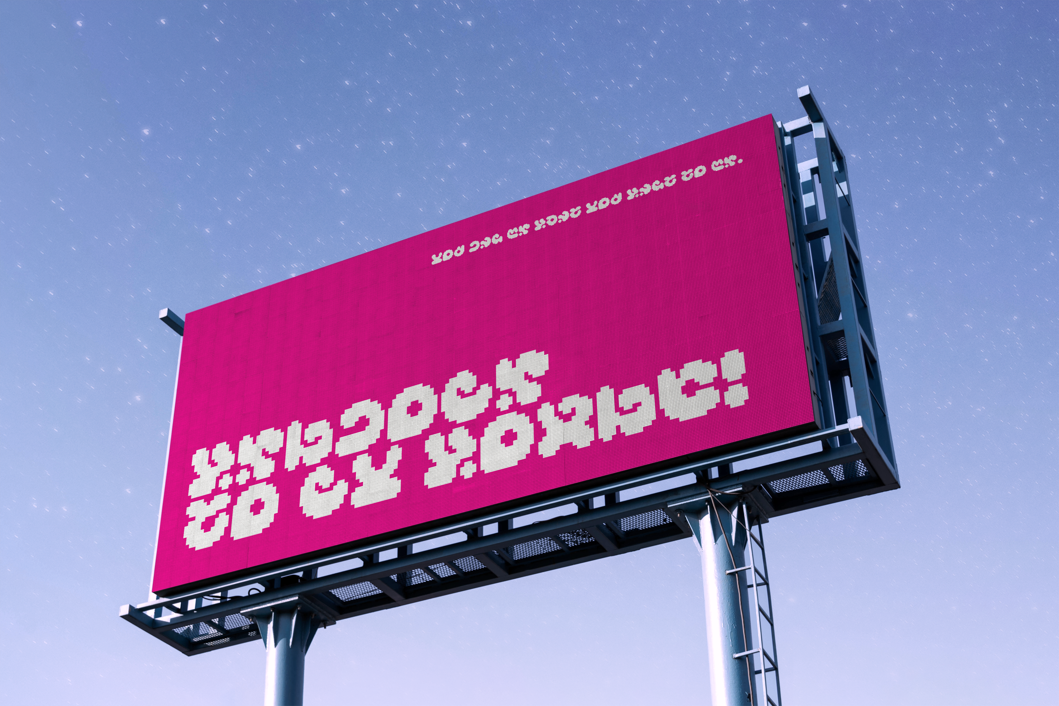
BLOOM PIXEL
︎︎︎ typeface design, experimental
What started as a project creating numerals for a new base-12 number system—rather than the standard base-10—became a fully functional typeface. BLOOM PIXEL RUNES is a bitmap font created for this invented number system and a new accompanying alphabet. The shapes of the numerals were inspired by finger-counting; the alphabet by finger-spelling. BLOOM PIXEL LATIN was created afterwards, using the style of the runes for a matching latin-alphabet typeface. Think of it like a secret language for adorable video game aliens.
︎ featured in University of Florida’s Ligature 32 juried exhibition!
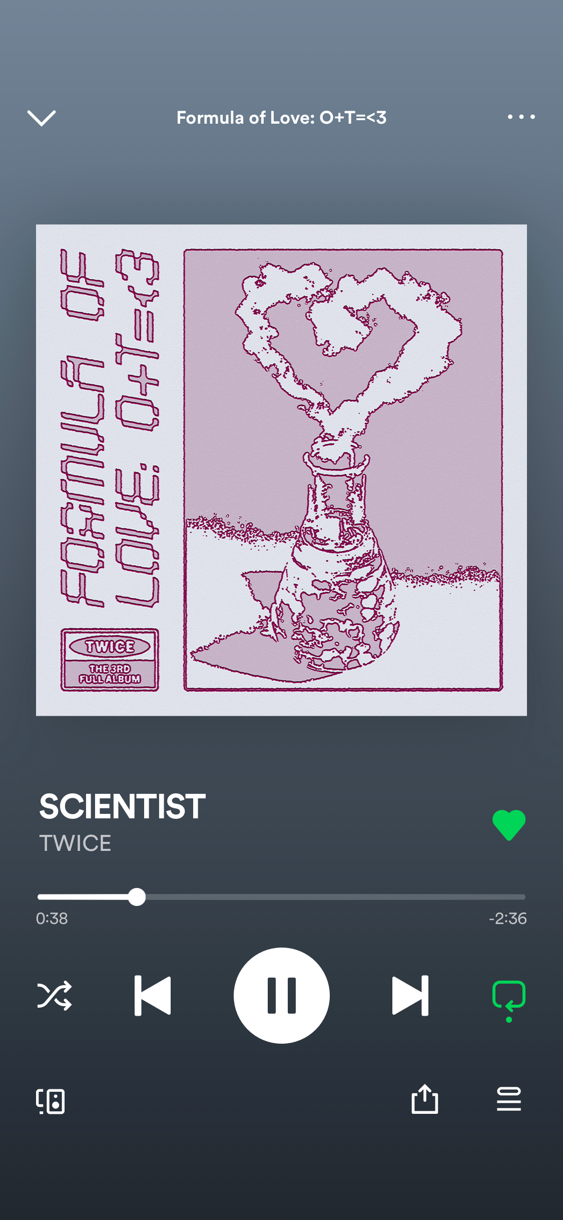
Formula of Love
︎︎︎ album redesign, branding
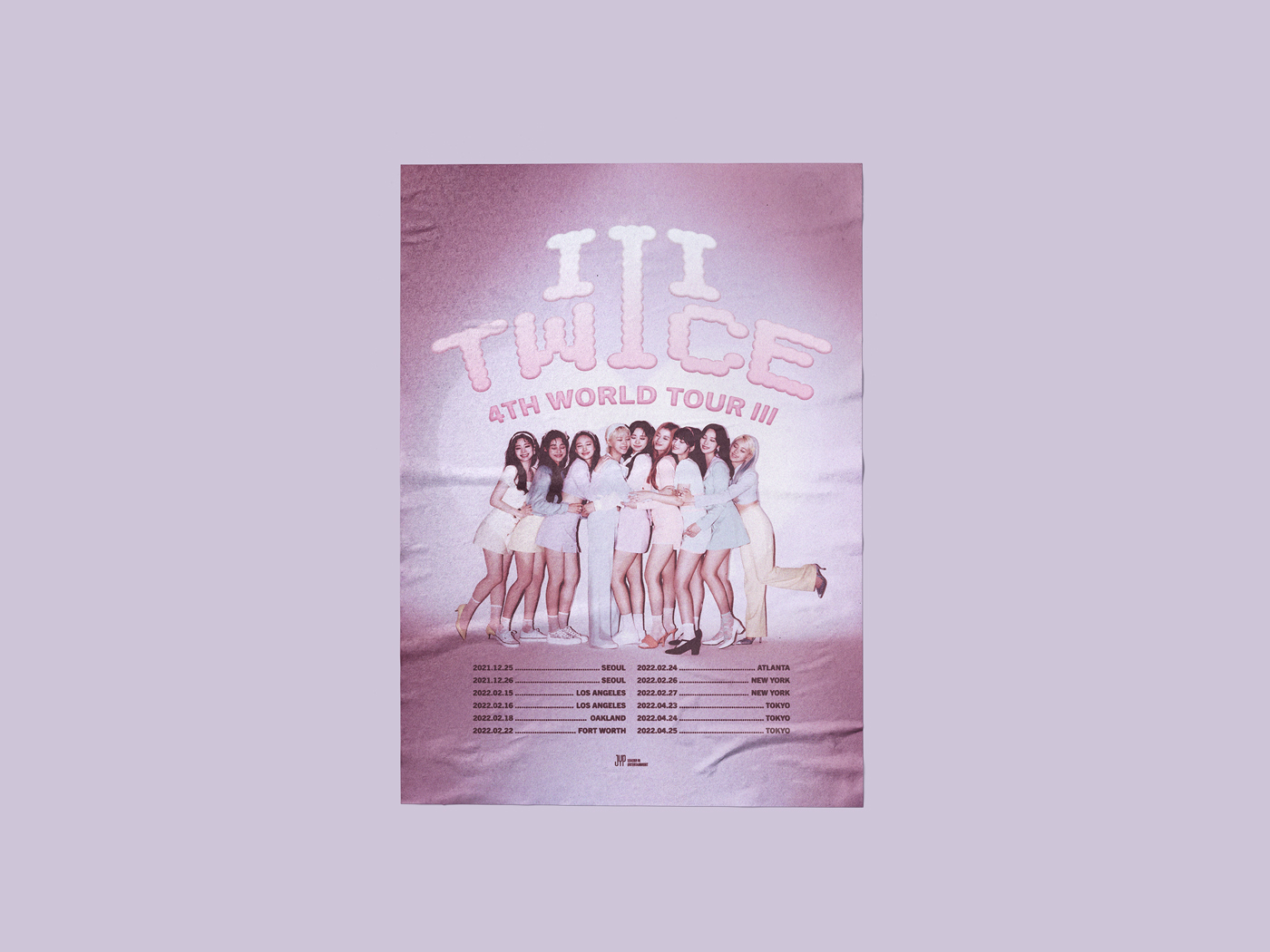
This project’s objective was to translate the perceived identity of TWICE’s album Formula of Love: O+T=<3 into a visual system. The design conveys the album’s story of searching for the meaning of love by playfully pushing the scientific concept, in line with the wordplay in the album’s title and the retro sound and romantic theme of its songs. I also redesigned the poster for the accompanying world tour, “TWICE 4TH WORLD TOUR: III.”
︎ featured in University of Florida’s Ligature 32 juried exhibition!
︎ featured in University of Florida’s Ligature 32 juried exhibition!


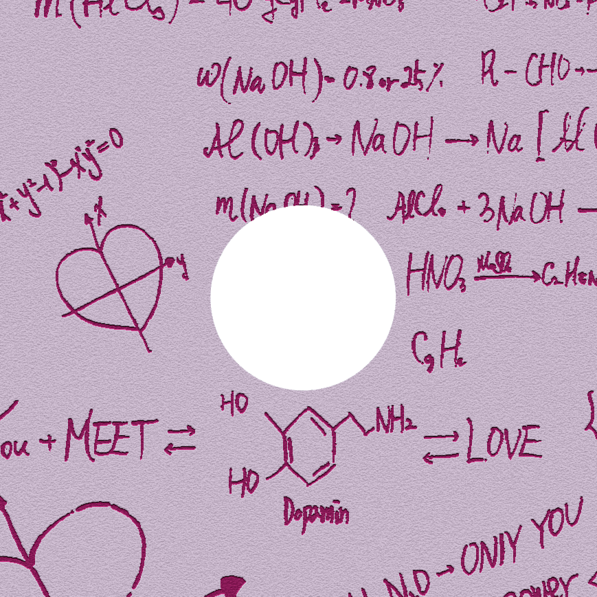
I did not choose to redesign this album because I disliked the cover, but because I loved the “scientific but cute” concept and wanted to see if I could push it even further. As the next album in TWICE’s discography did not feature a full group image on its cover, I wanted to see what this album would like without one as well. the illustrations used on the back cover and inner sleeve were taken from the teaser images and video and heavily edited to keep some elements of the original concept in.

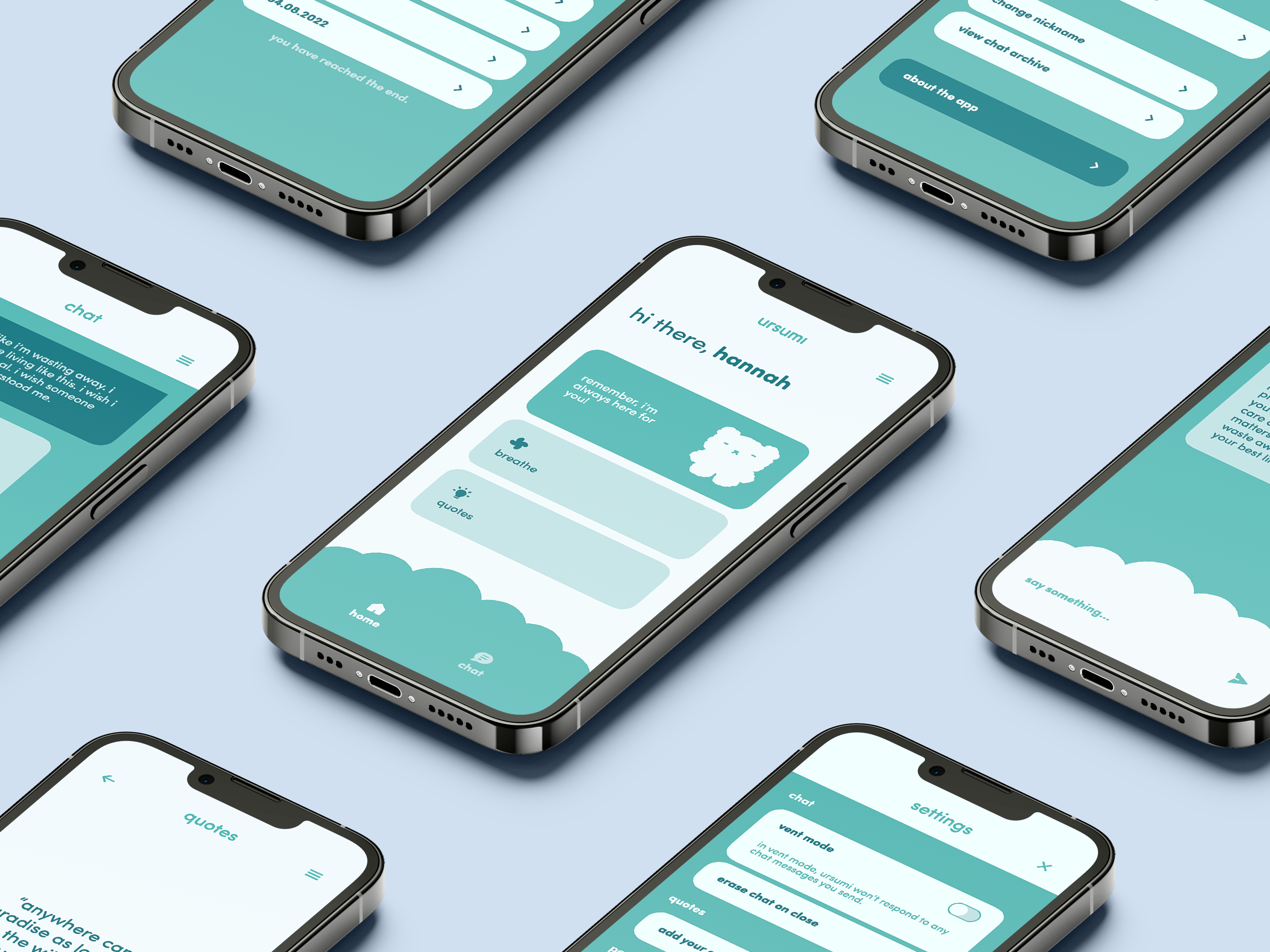
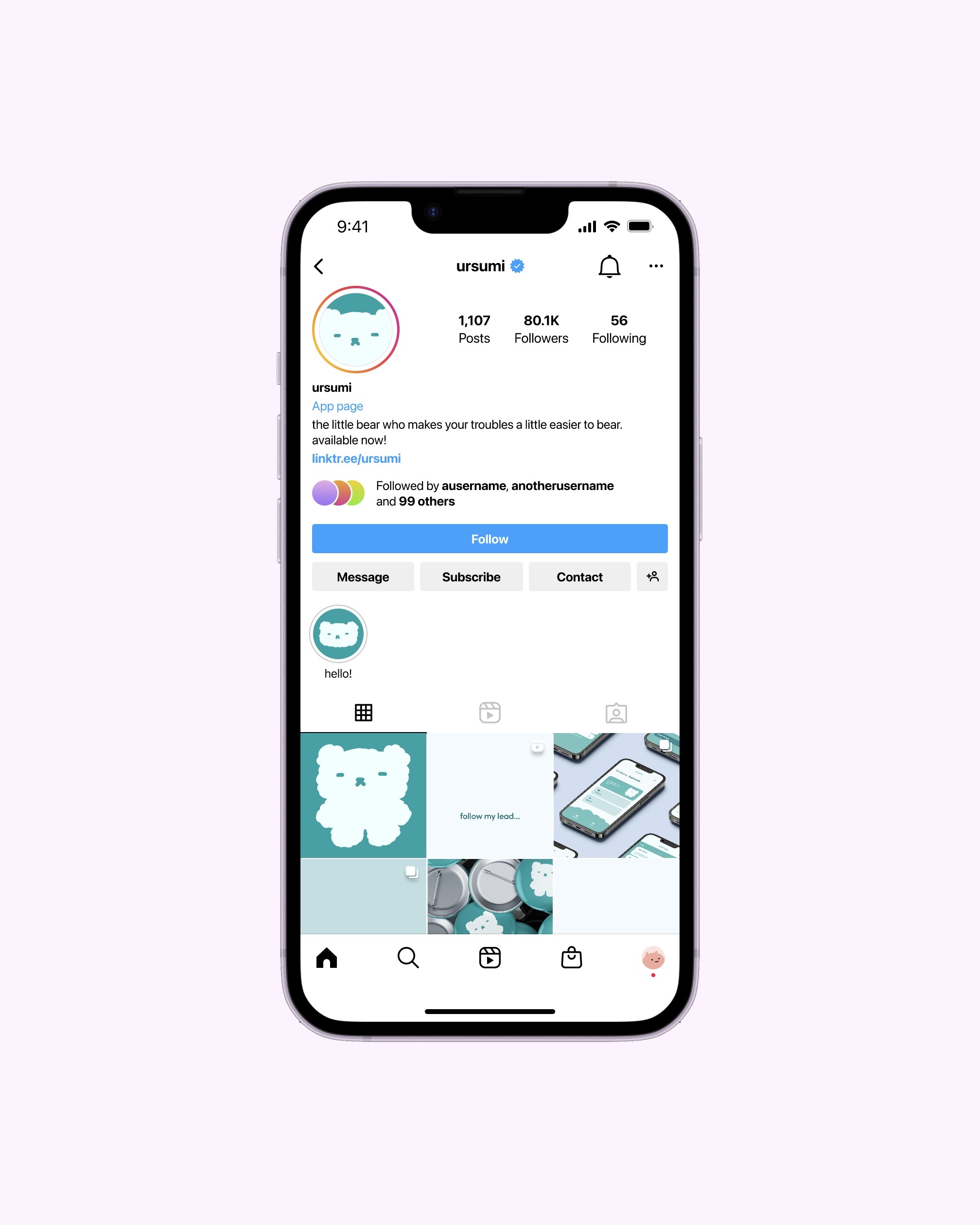
ursumi
︎︎︎ app design, branding, mascot design
ursumi is a hypothetical mental health app designed for both phone and smartwatch. A few simple but powerful functions make this free app extra unique and accessible. The concept for ursumi came from the lack of mental health apps I have personally found helpful and safe. ursumi gives people someone to talk to when they feel like they can’t talk to anyone else, and everything said to ursumi is kept with ursumi only.

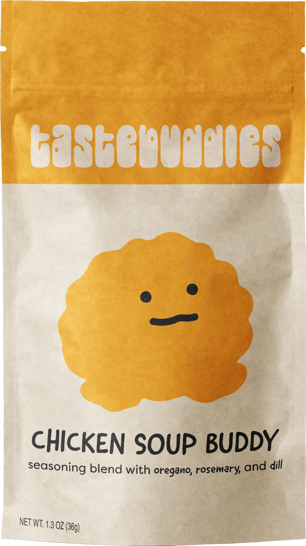
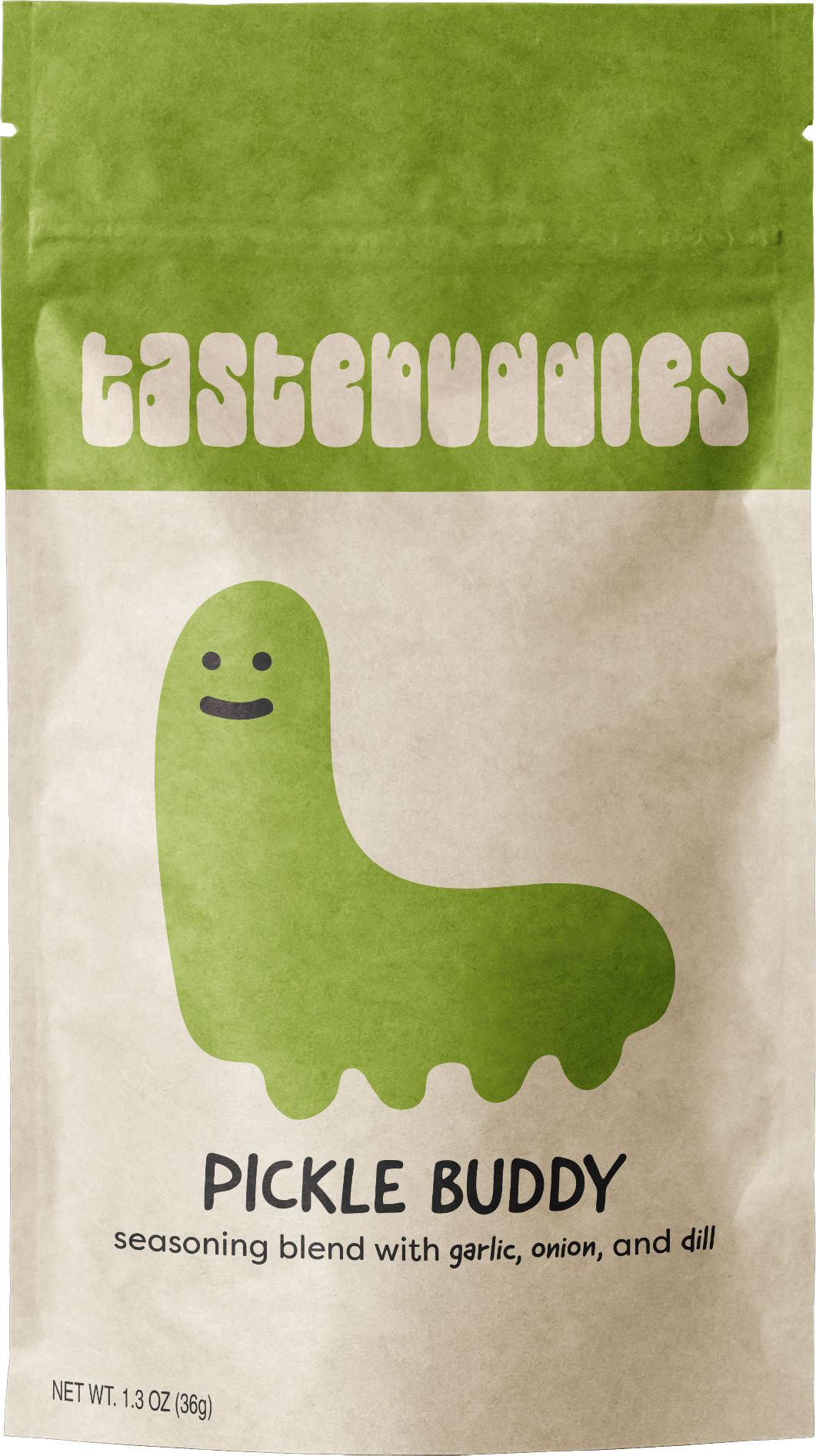
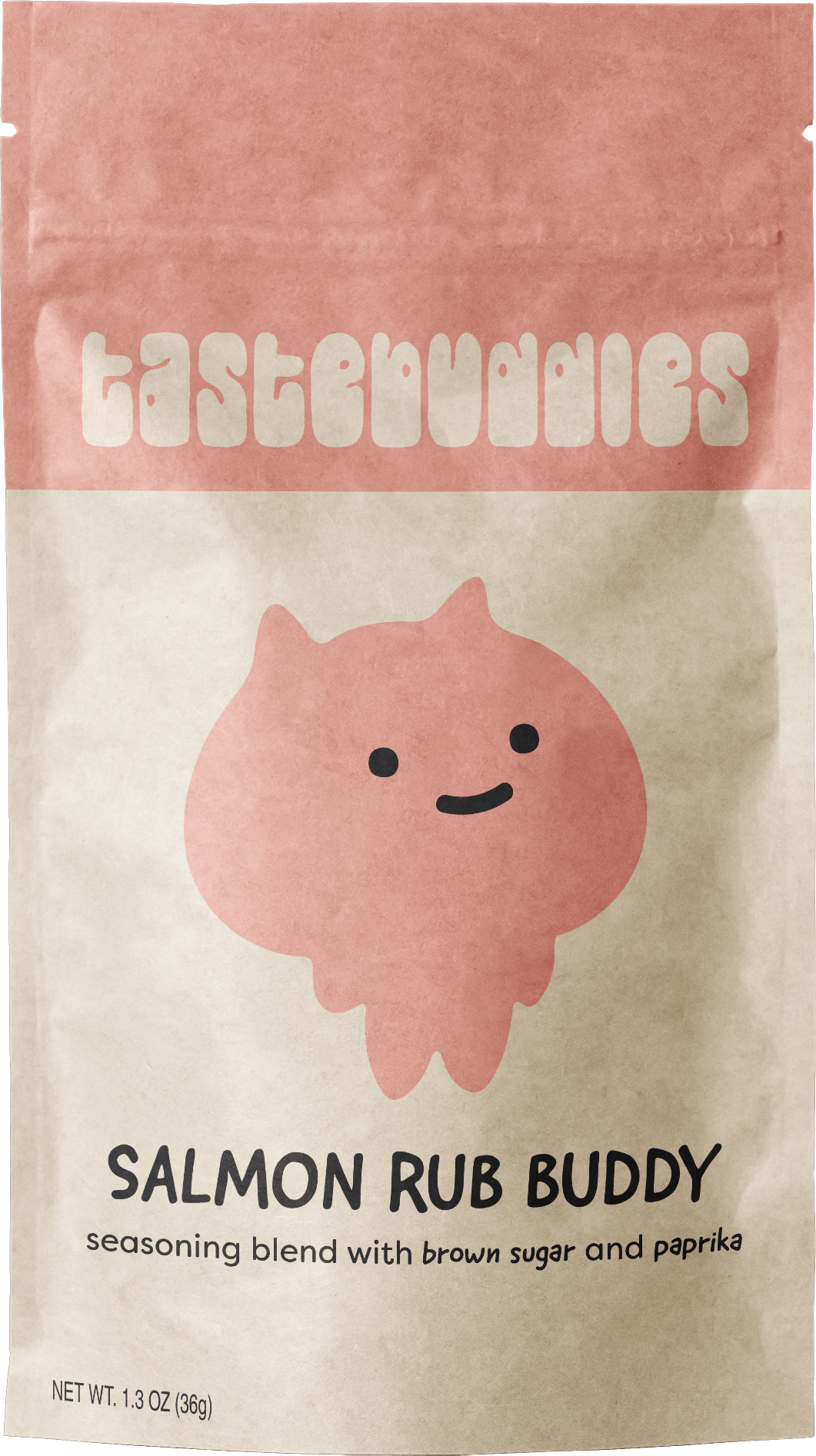
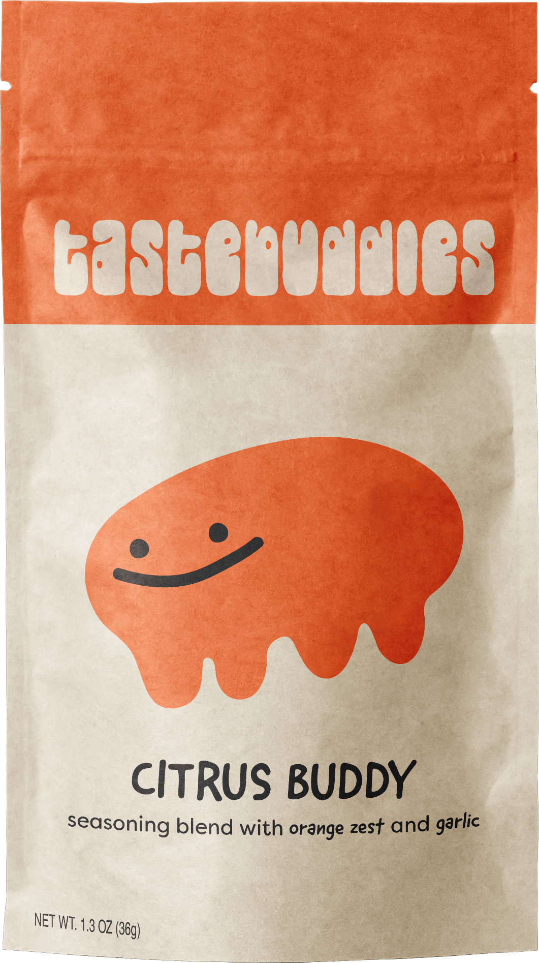
tastebuddies
︎︎︎ branding, mascot design
tastebuddies is a concept for a seasoning blend brand with mascots associated with each mix. The idea was inspired by my own childhood memories of playing with the spices in our kitchen’s spice rack. Unique flavor blends and a playful visual identity communicate a sense of childlike wonder.
this page is a work in progress !!